Layan

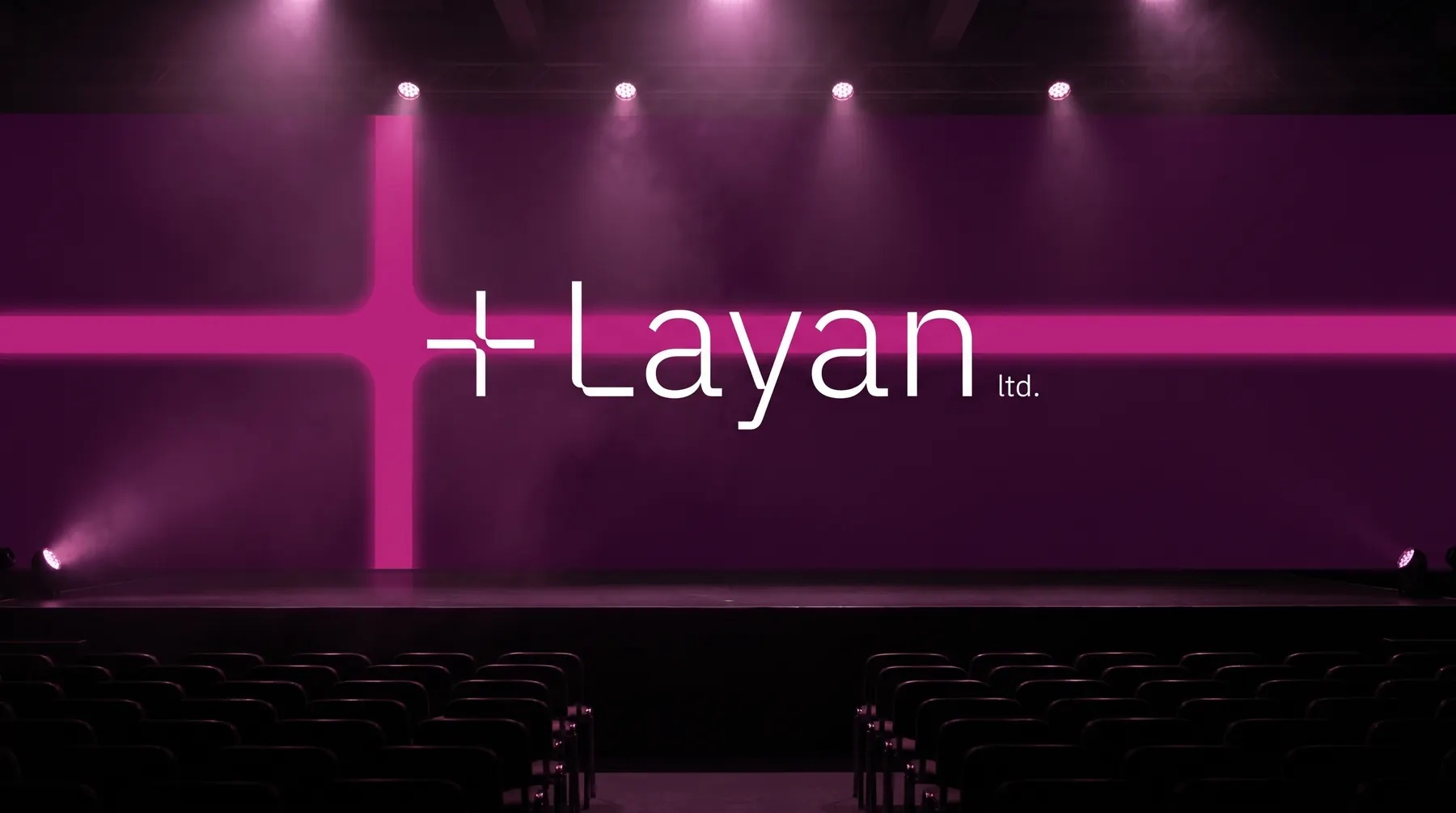
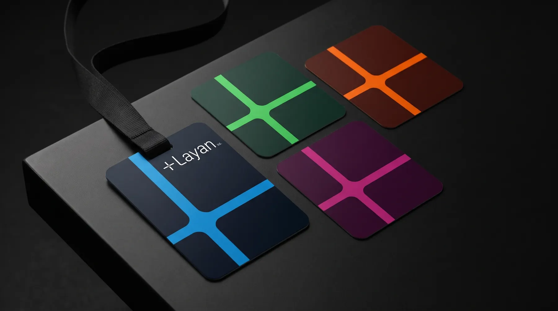
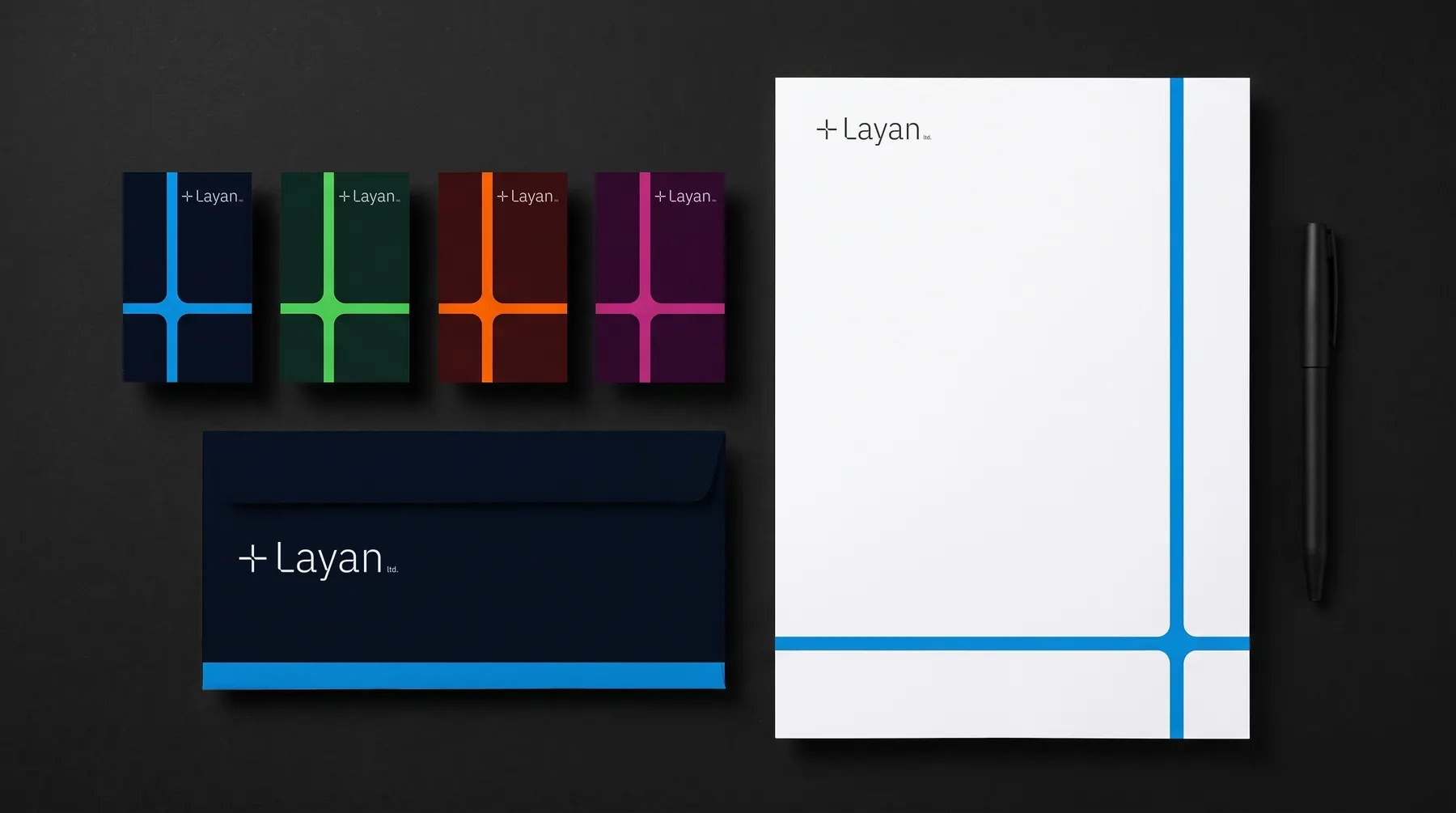
Layan is an event management company that turns a client’s vision into an evening people remember, with elegance and precision. We built a light wordmark around a plus sign with softly rounded inner corners, then grew it into crossing bands in four colour pairs, each bright colour on its own dark ground, set in IBM Plex, for the stage, invitations, badges and stationery.
- Client
- Layan
- Services
- Brand identity, Brand guidelines
- Sector
- Event management
- Year
- 2024
- Visuals
- Concept visuals for the stage, entrance and print
01
Logo
A light wordmark after a plus sign with softly rounded inner corners, in English and Arabic.

02
Colour
Four pairs, each bright colour on its own dark ground.
- Blue#0C93E5
- Night#050F1E
- Green#4CD159
- Forest#0A261E
- Orange#F76300
- Ember#3F0F0F
- Magenta#BC287C
- Plum#350A2D
03
Typography
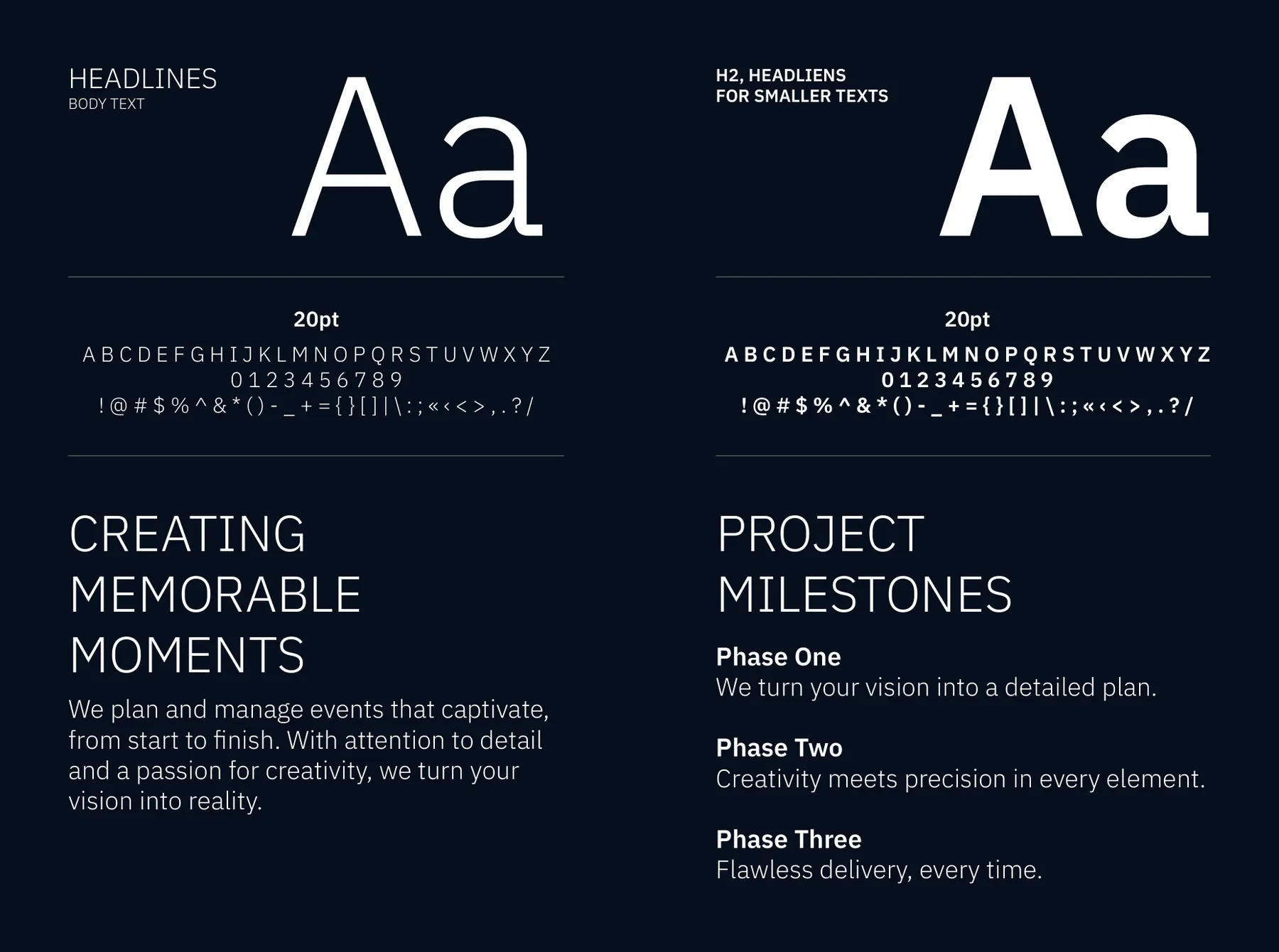
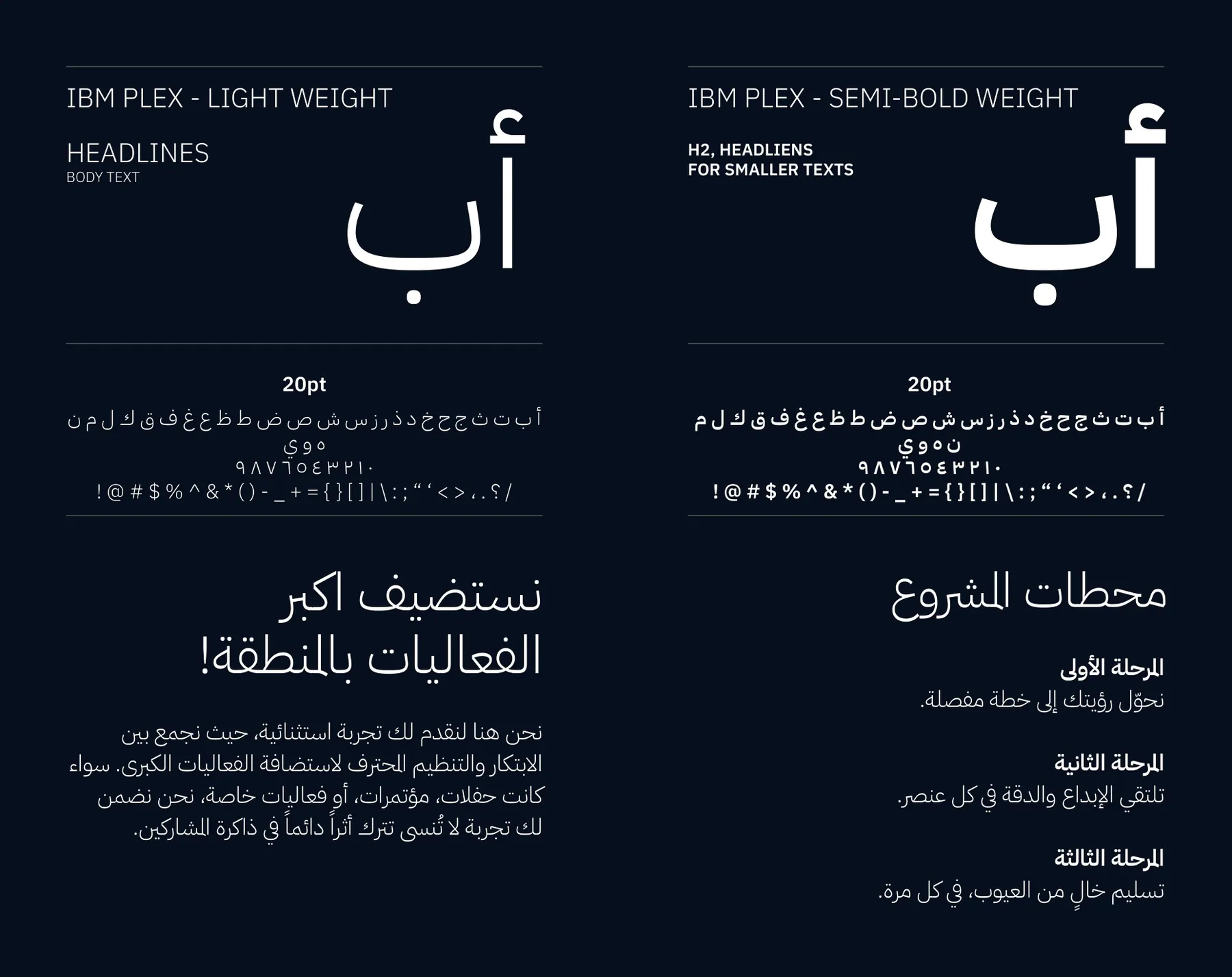
One family, two scripts: light for the moments, semi-bold where information has to be found fast.
- IBM Plex Sans
- English
- IBM Plex Sans Arabic
- Arabic
04
Applications
 Next projectFenna Architects
More works
All case studies
Let’s create something memorable together
Get in touchhey@thatgroup.co