Opal Coffee House
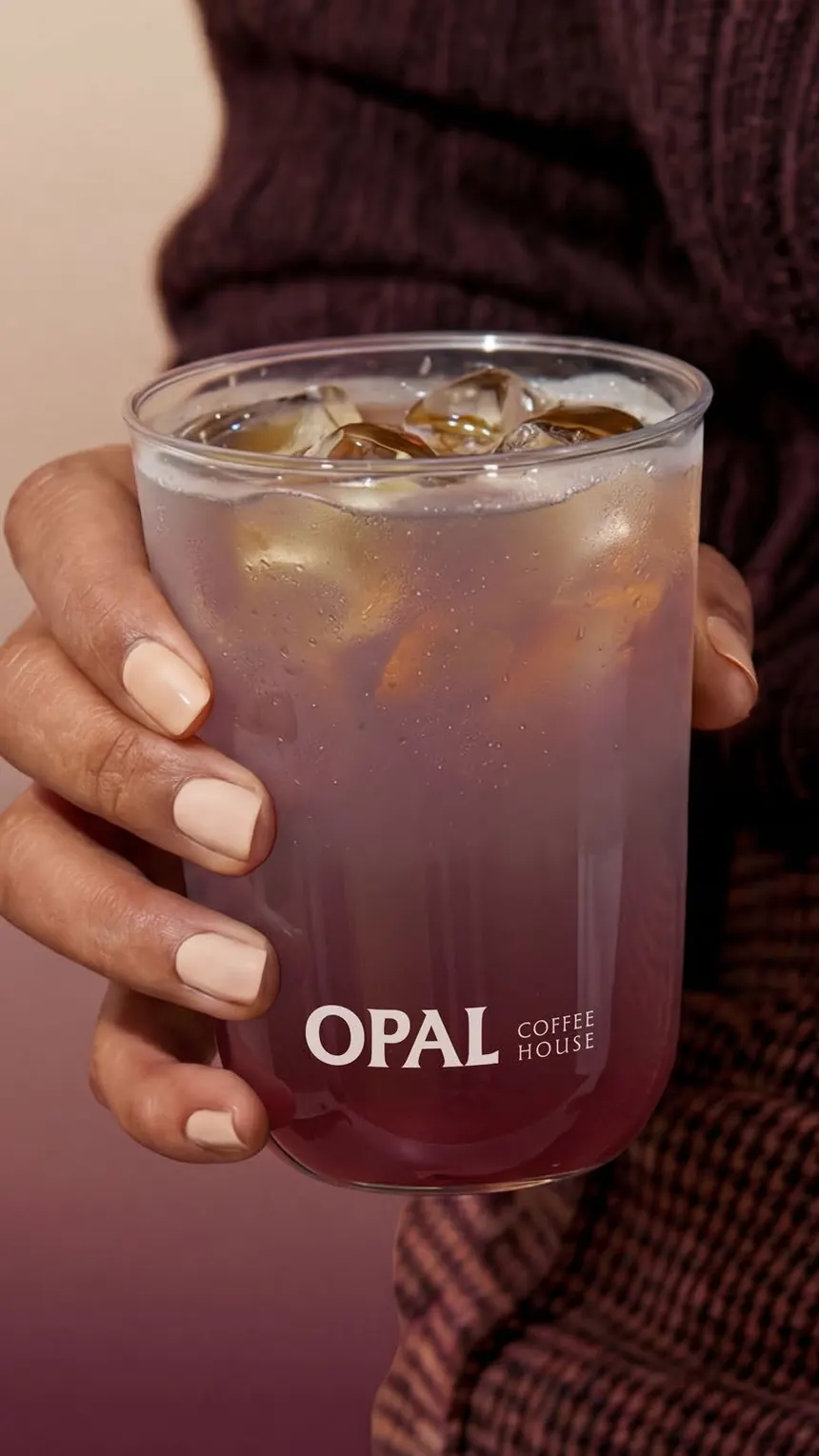
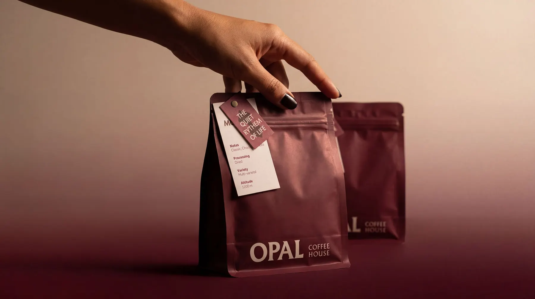
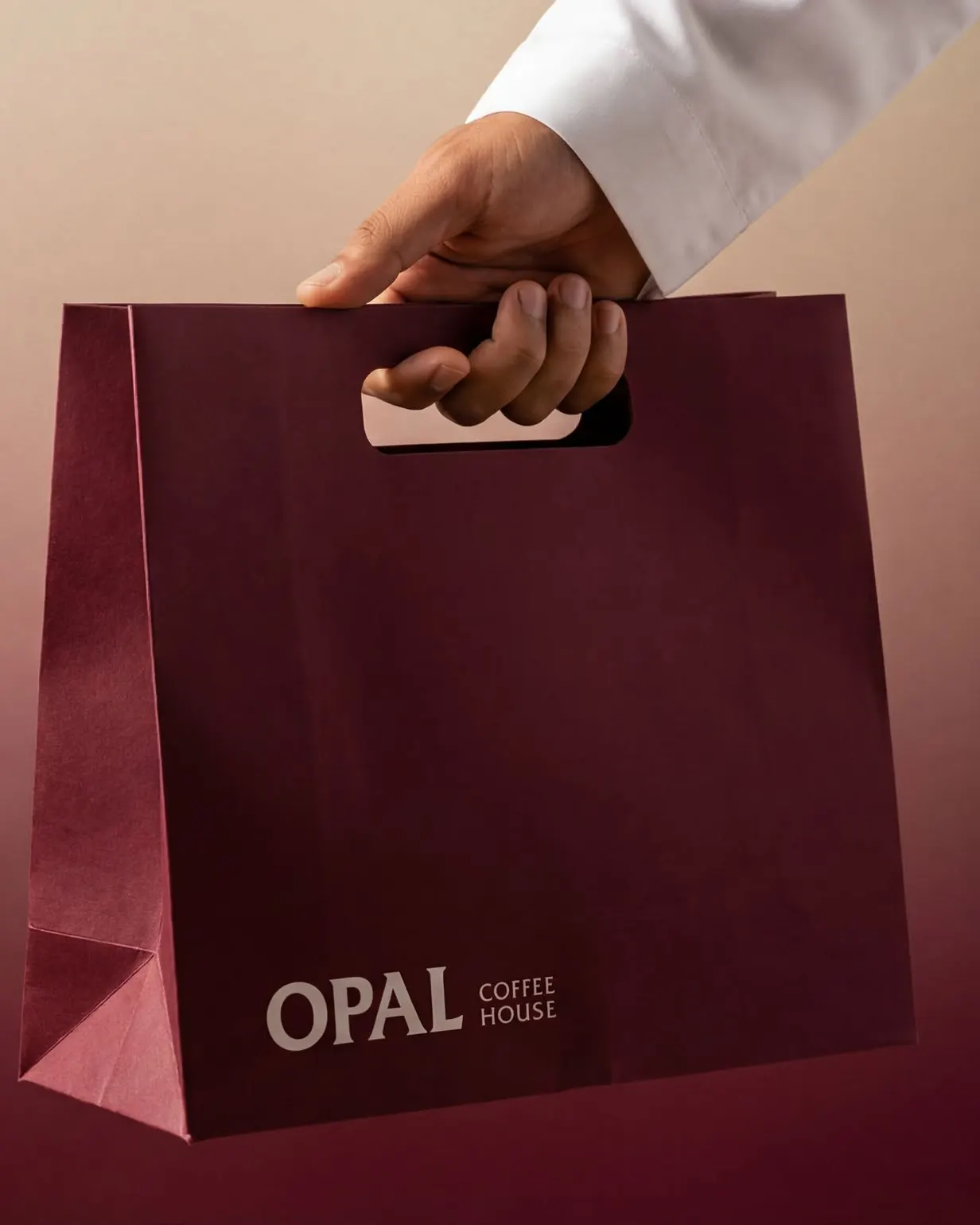
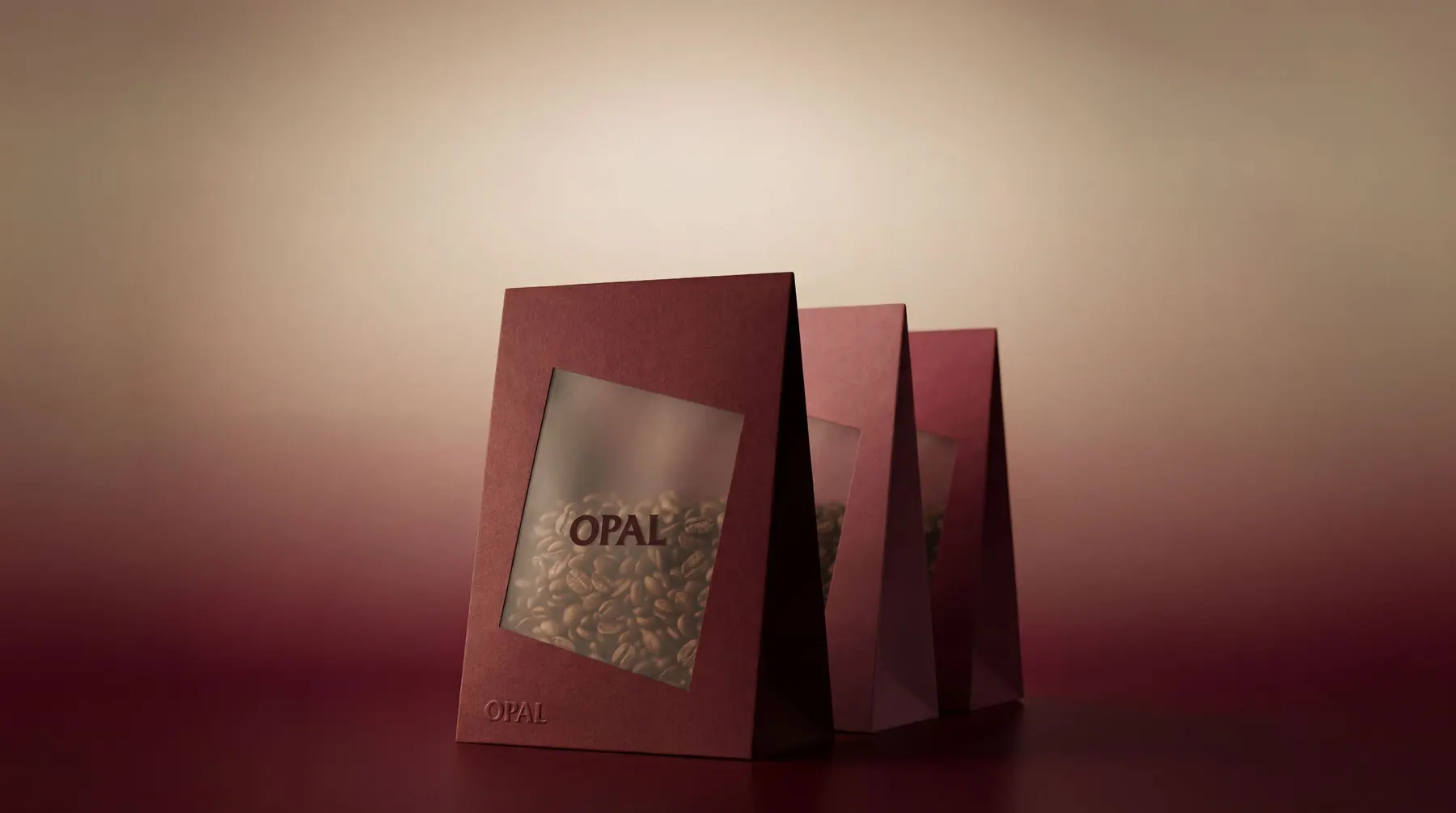
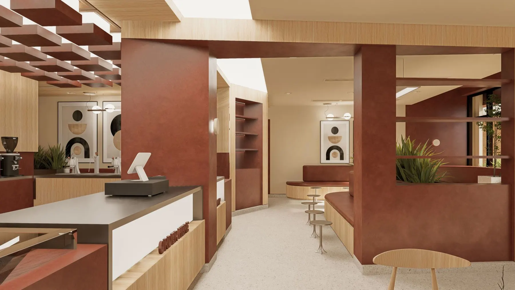
Opal is a coffee house in Riyadh built on one belief: true luxury is quiet. We gave it a calm serif wordmark, a palette of deep cacao, marsala and warm cream, a diamond pattern drawn from classic motifs and a soft illustration set, then carried it through bean bags, sweet boxes, cups, trays, paper bags, uniforms and the menus on the wall and at the table.
- Client
- Opal Coffee House
- Services
- Brand identity, Packaging
- Sector
- Specialty coffee
- Year
- 2025
Logo
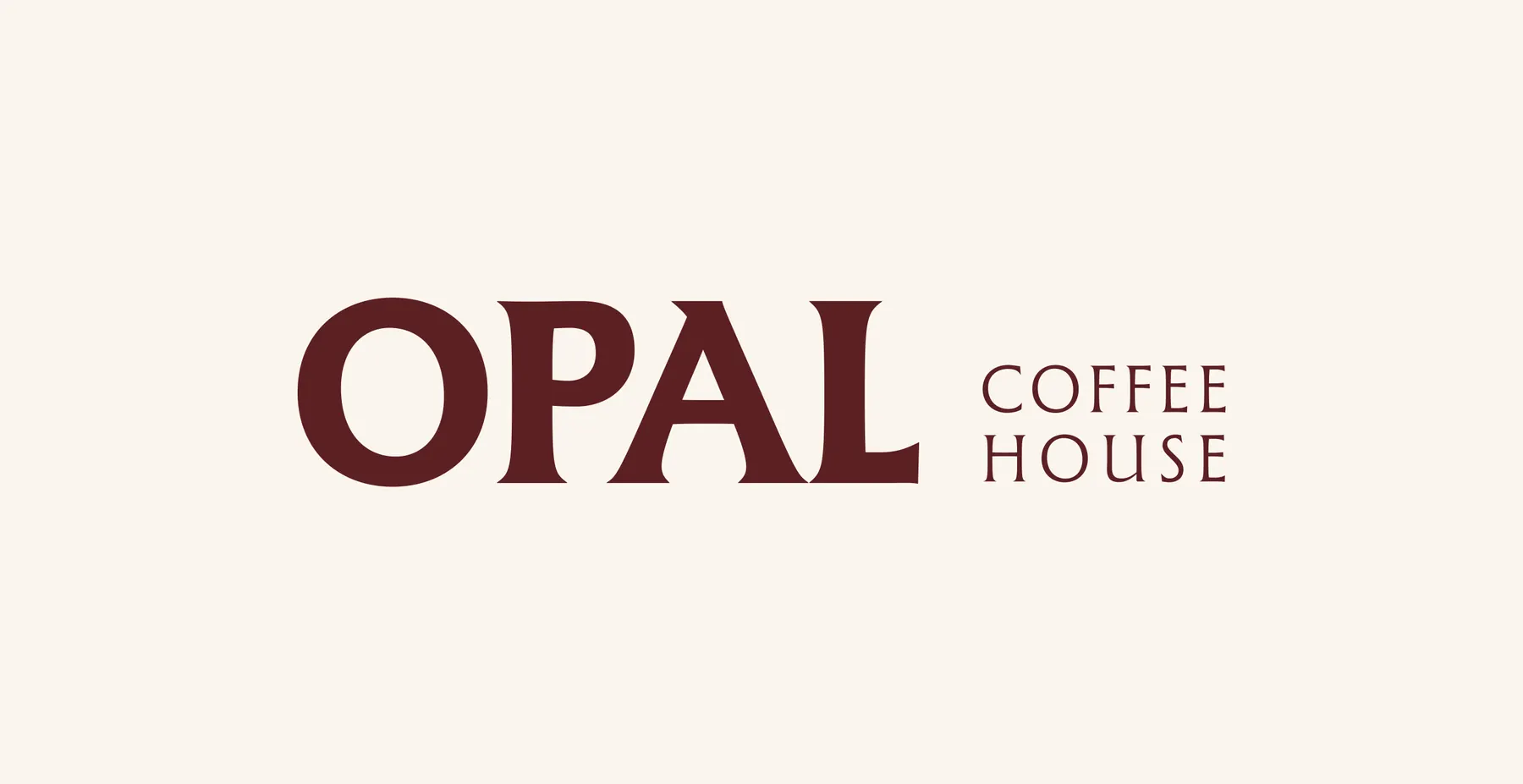
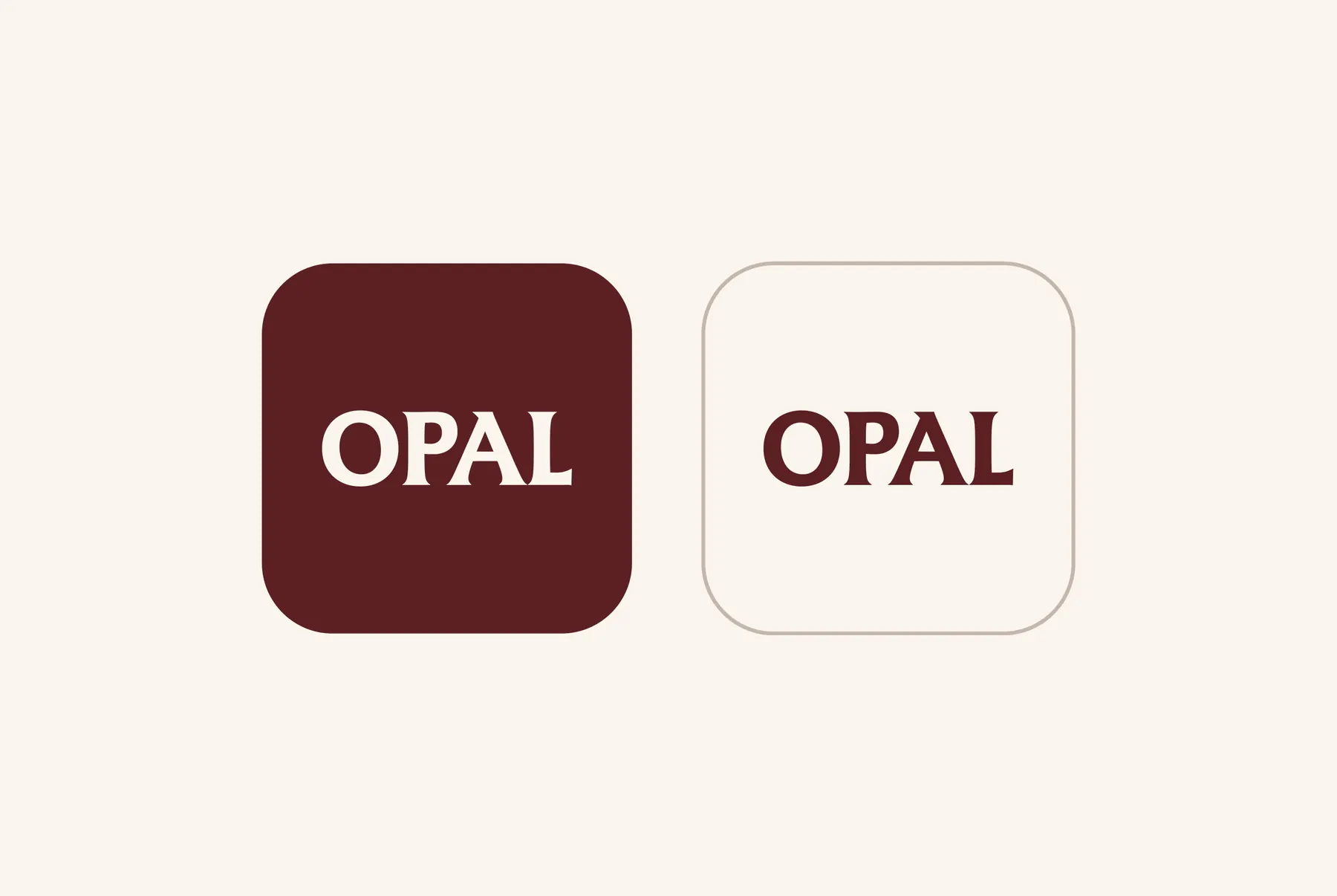
A calm serif wordmark in three forms: the full name, a short version with Coffee House set small, and a square icon.
Colour
Warm earth tones instead of black: a cream base, dusty mauve and marsala accents, and two deep browns.
- Warm Cream#FCF5F0
- Dusty Mauve#A86374
- Marsala#9C4757
- Espresso#5C2124
- Deep Cacao#370808
Typography
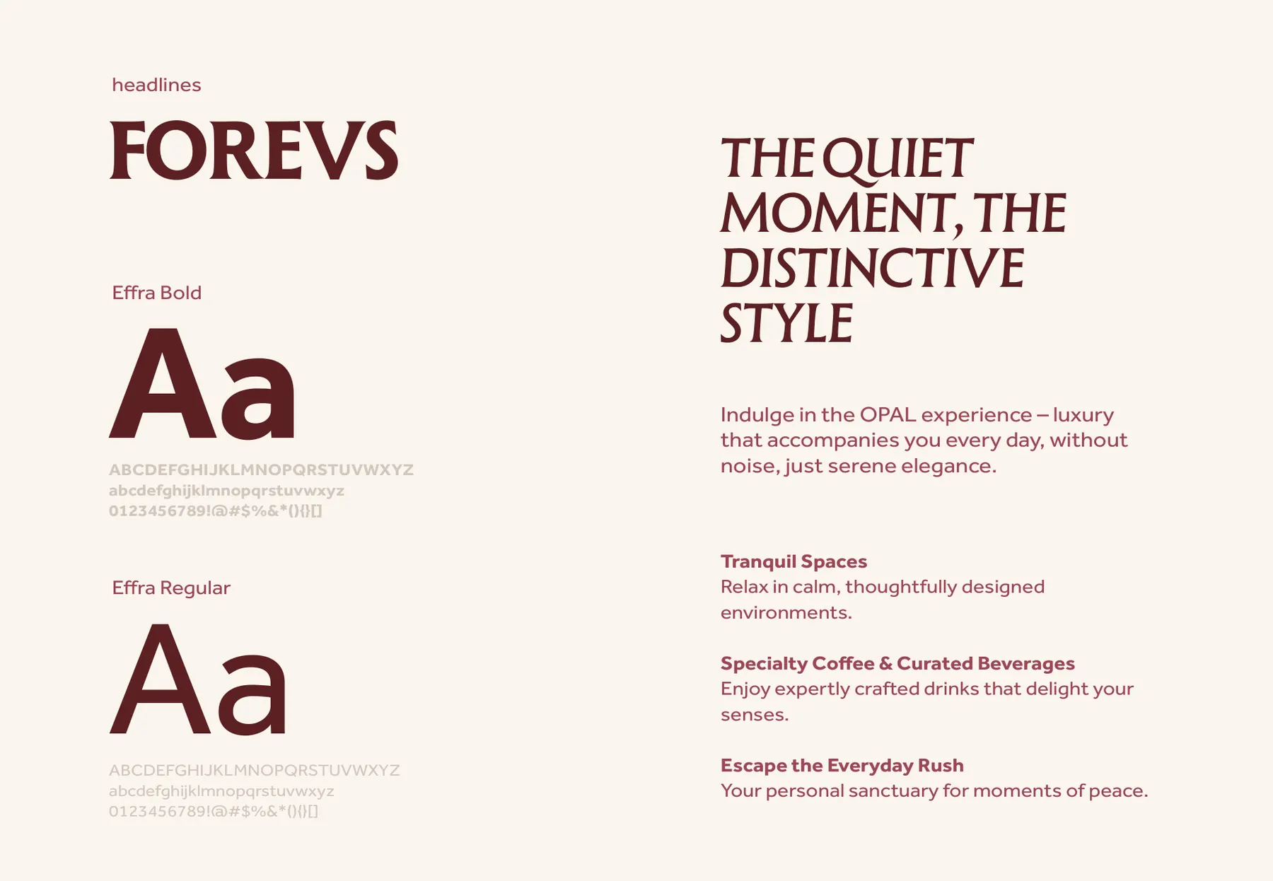
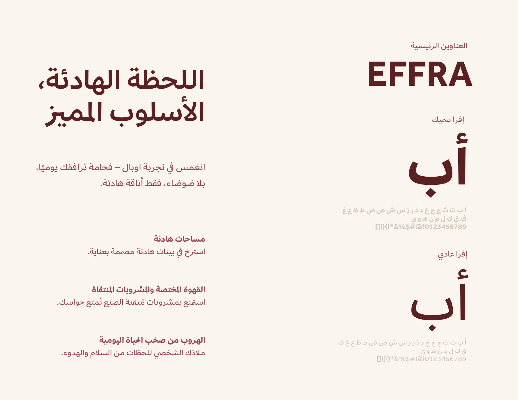
A refined display serif keeps the quiet luxury in the headlines; Effra keeps everything else easy to read, in both languages.
- Forevs
- English display headlines
- Effra
- English text
- Effra Arabic
- Arabic
Elements
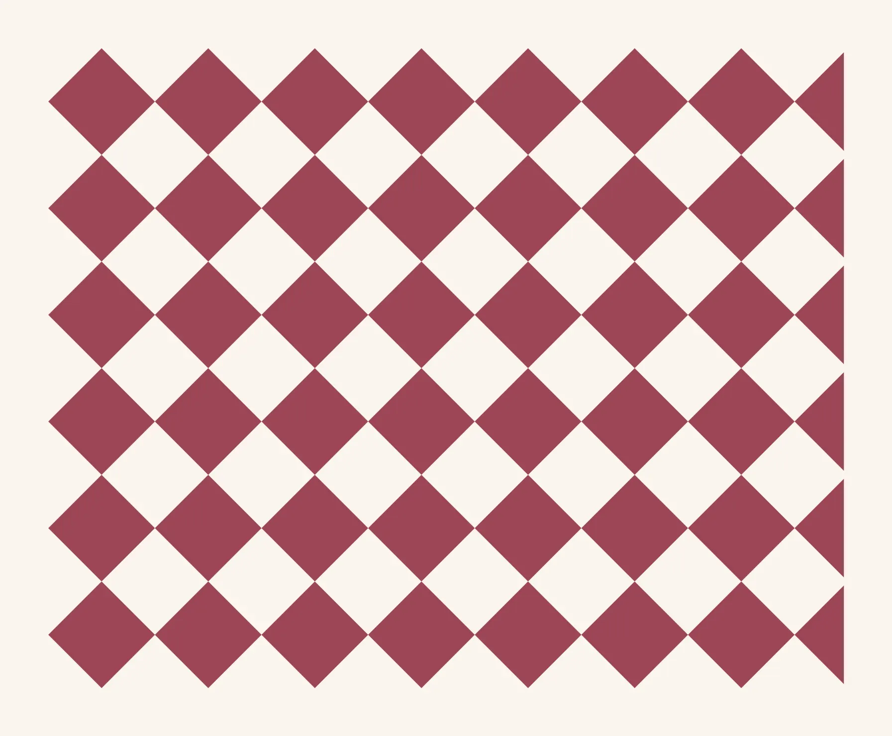
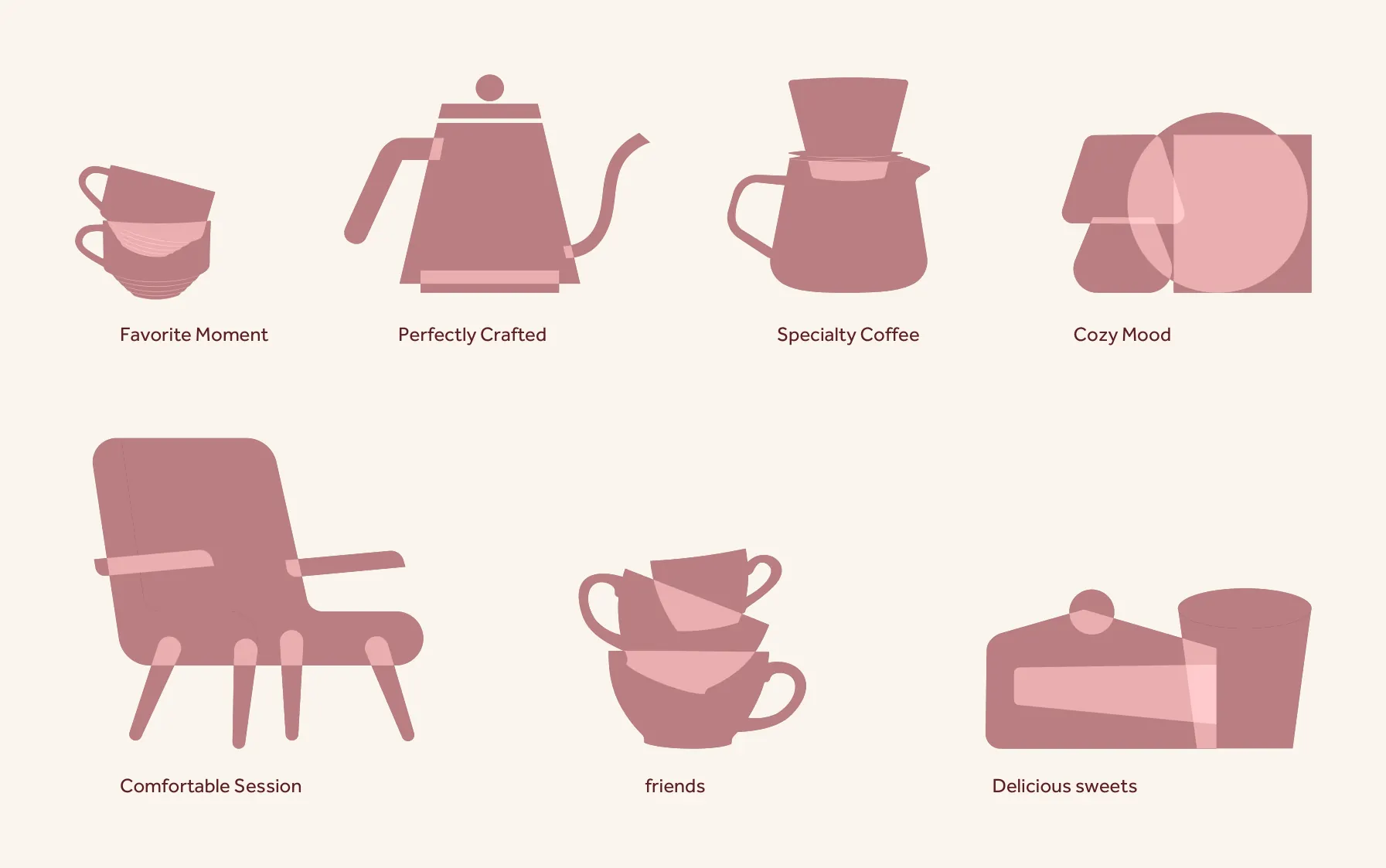
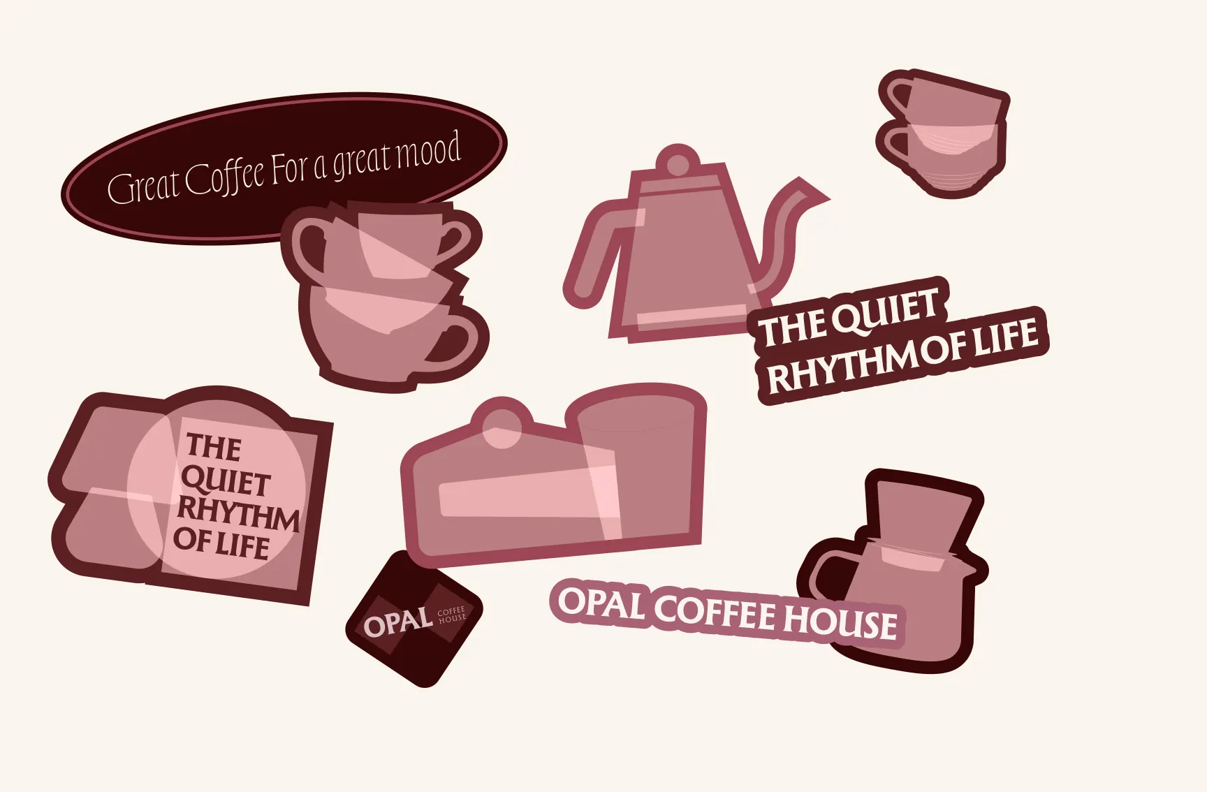
A diamond pattern from classic motifs and a soft illustration set that becomes stickers.
Print and packaging
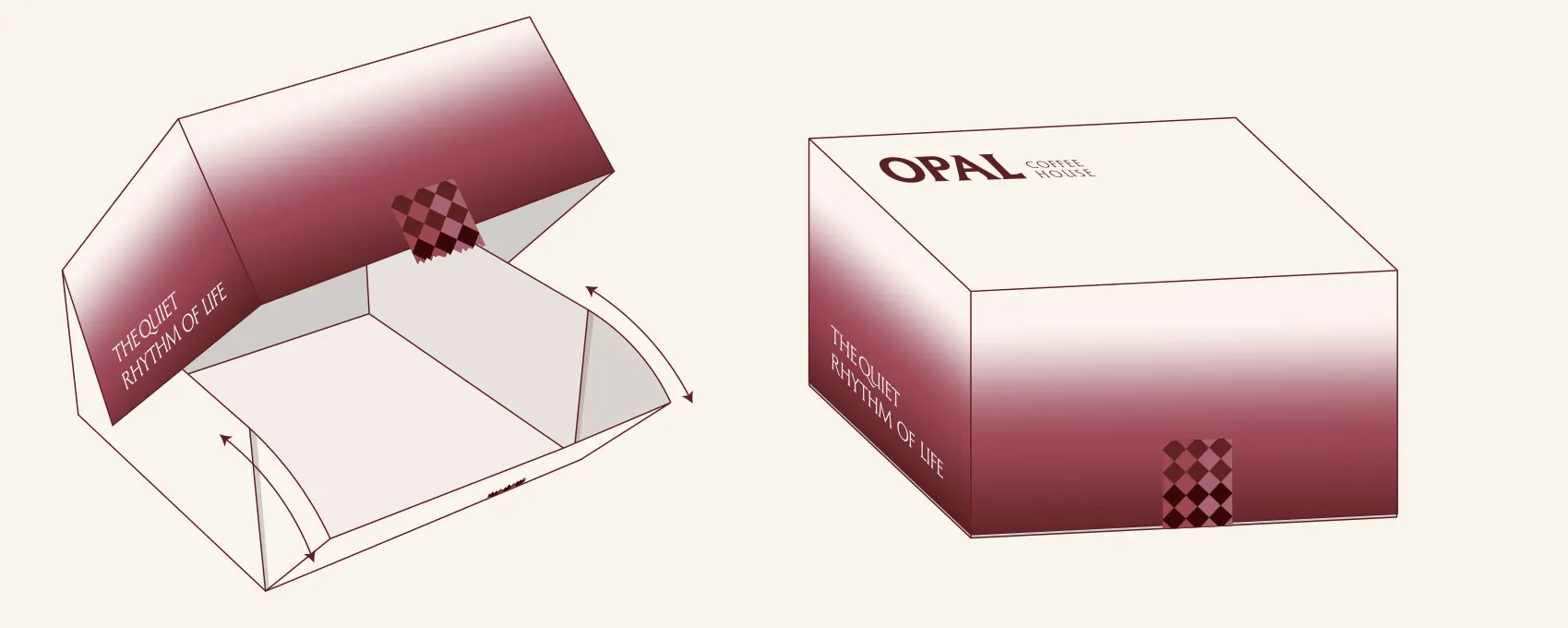
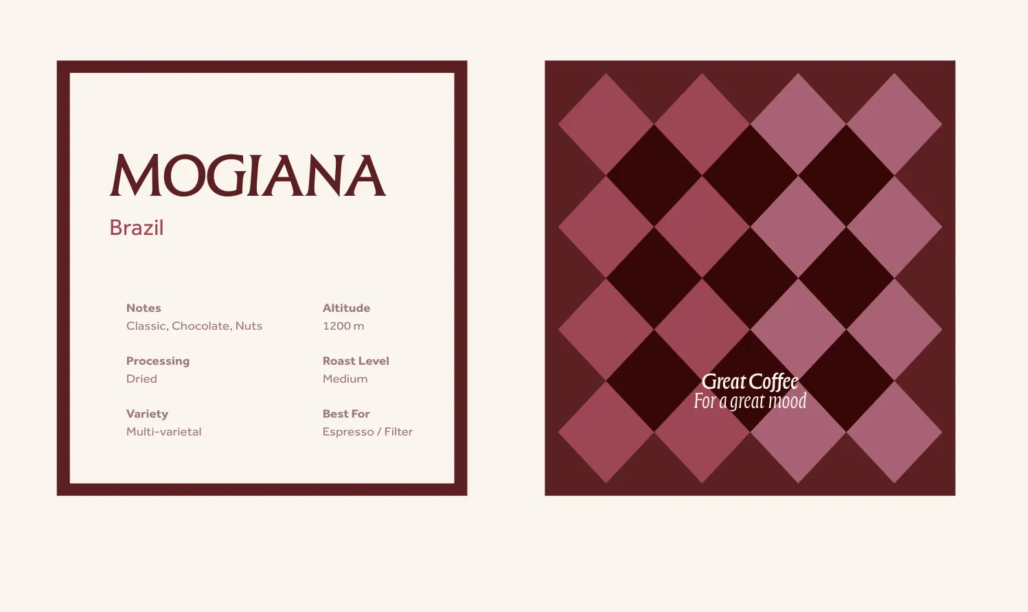
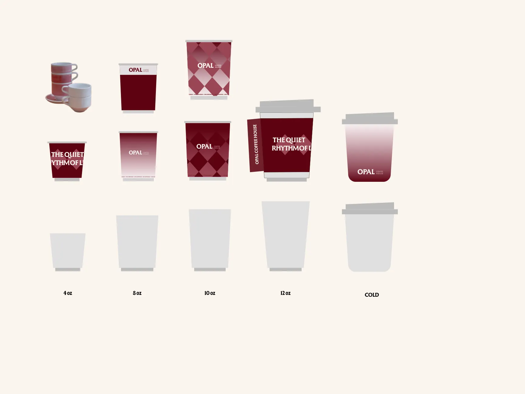
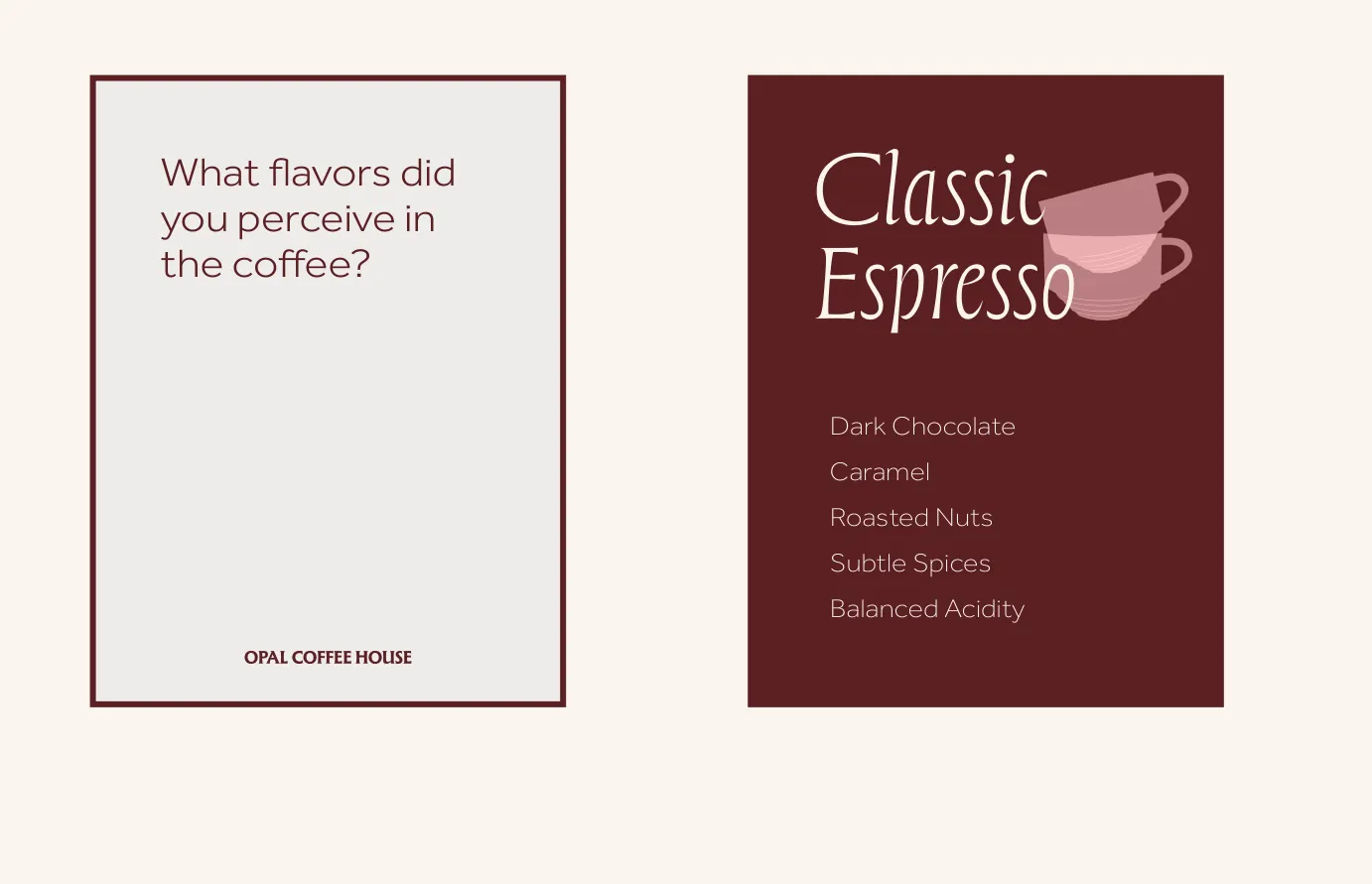
The sweet box, the bean card, the cups and the tasting card, drawn flat before they were made.
Social
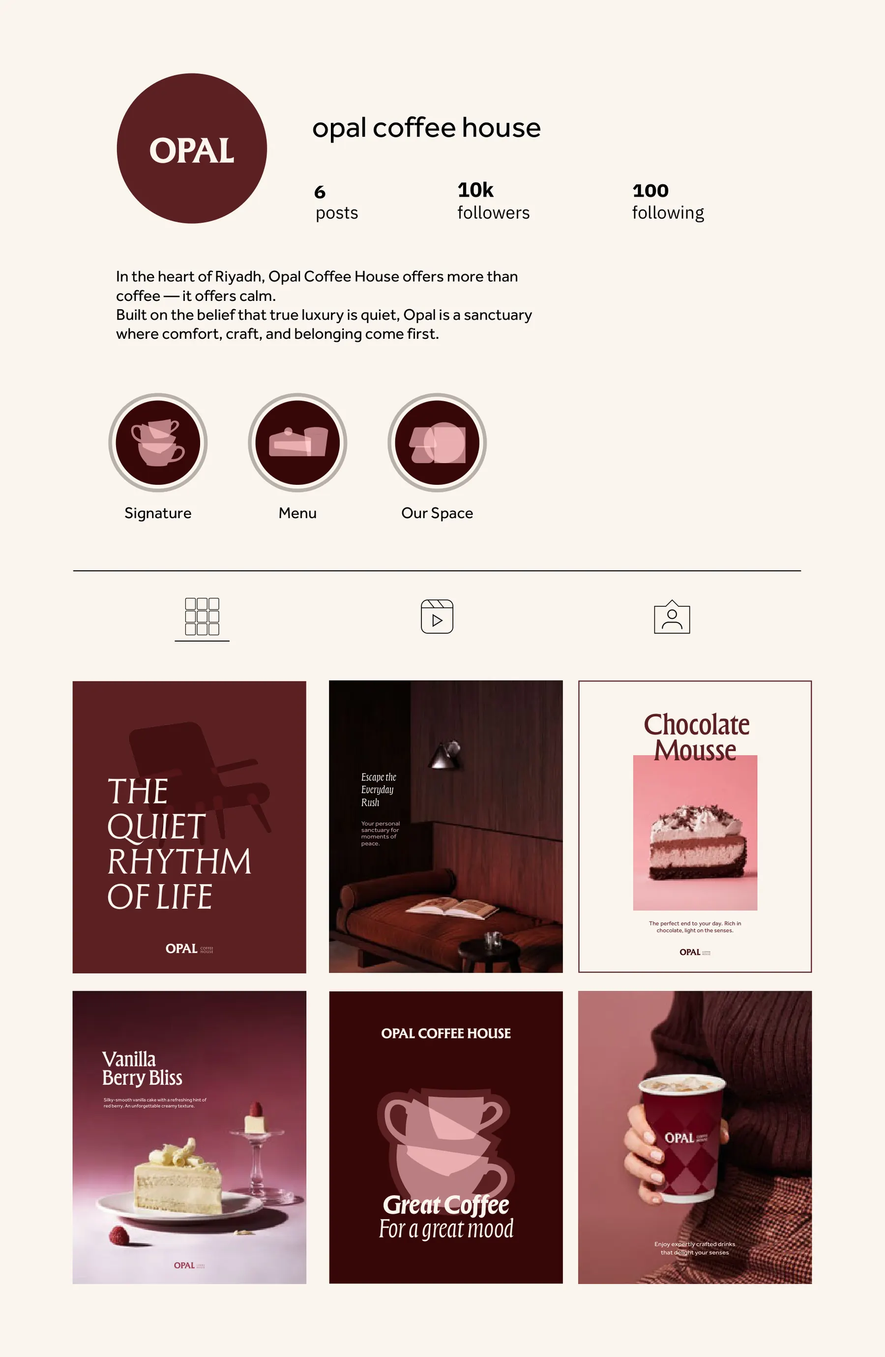
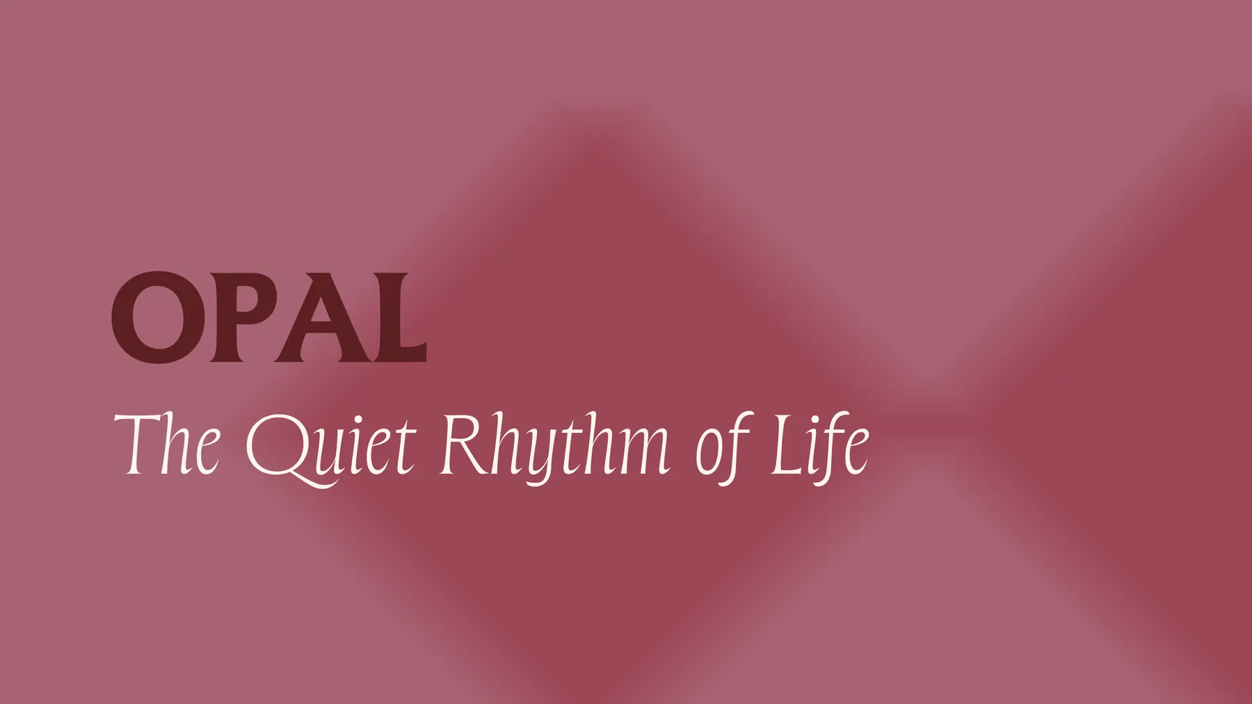
An Instagram page that keeps the quiet tone, with the line The Quiet Rhythm of Life.
Applications
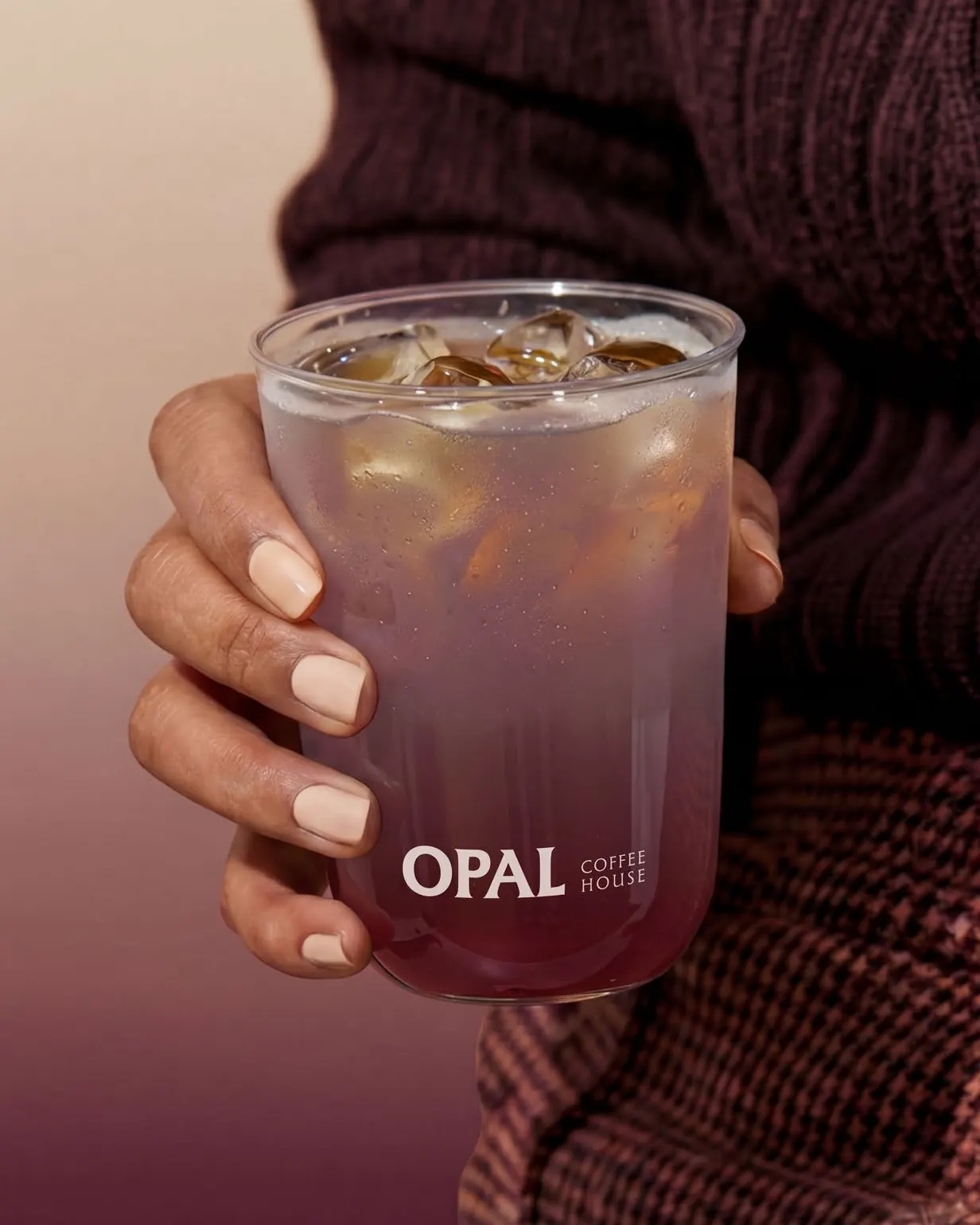
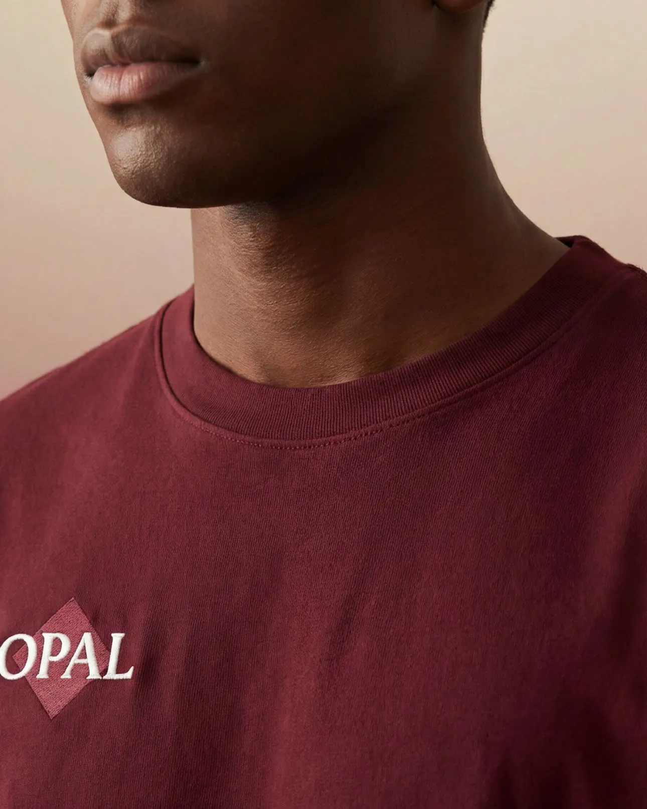
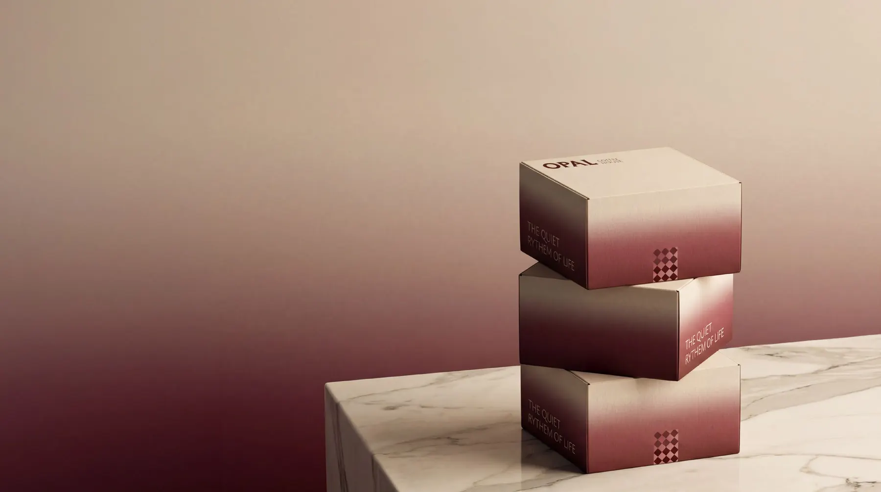
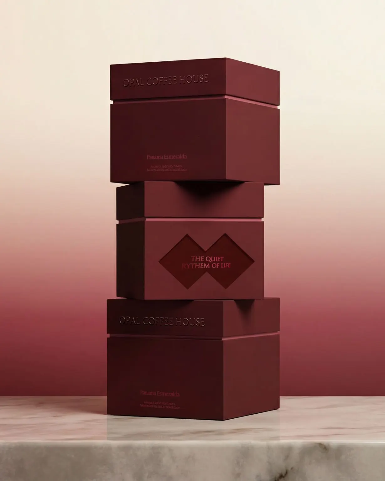
 Next projectKhalil Tea
More works
All case studies
Let’s create something memorable together
Get in touchhey@thatgroup.co