Toleen

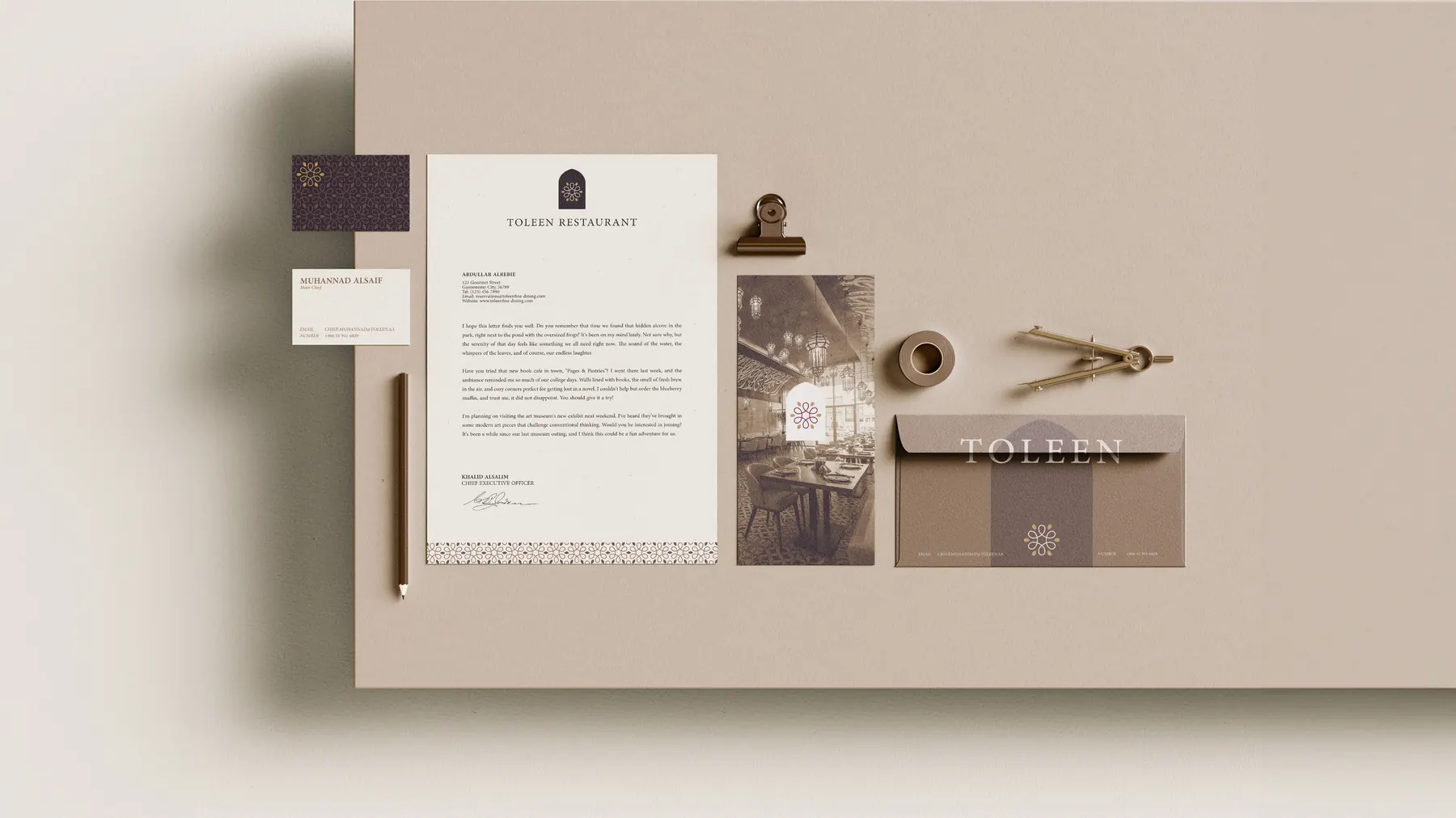
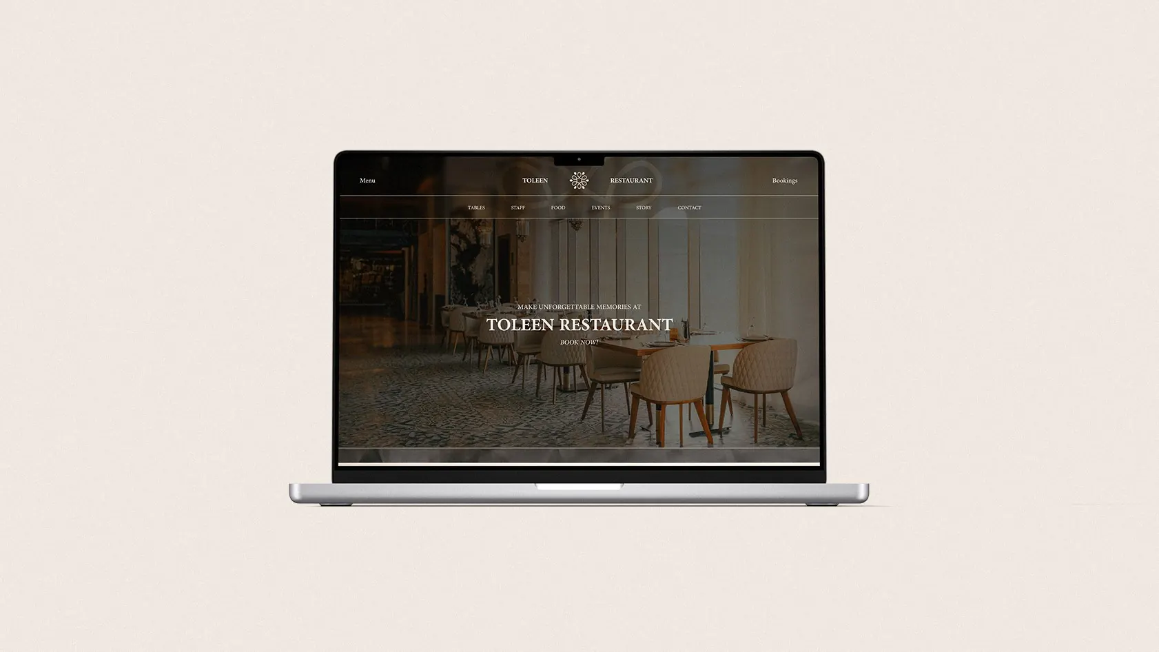
Toleen is a fine-dining restaurant where the brand is set before the first course arrives. We designed it from the plate outward, uniforms, tableware, and signage through to a booking-ready website and a mobile app, so the sense of occasion stays consistent from the street to the table.
- Client
- Toleen
- Services
- Brand identity, Packaging
- Sector
- Fine dining
- Year
- 2024
01
Logo
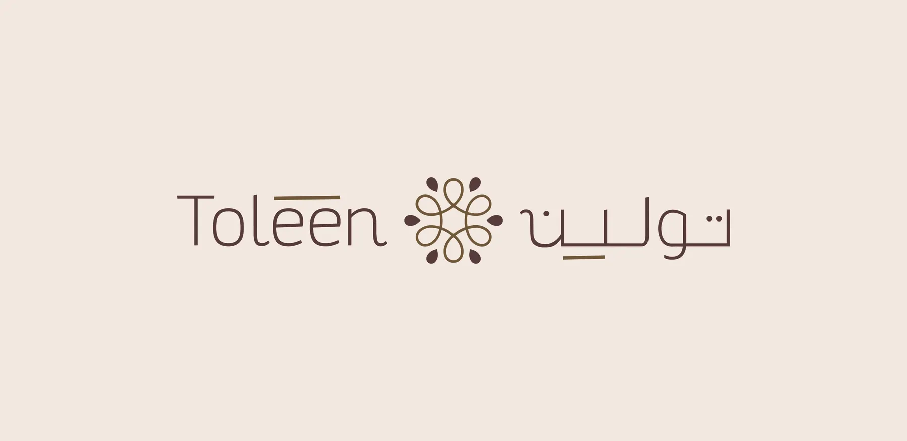
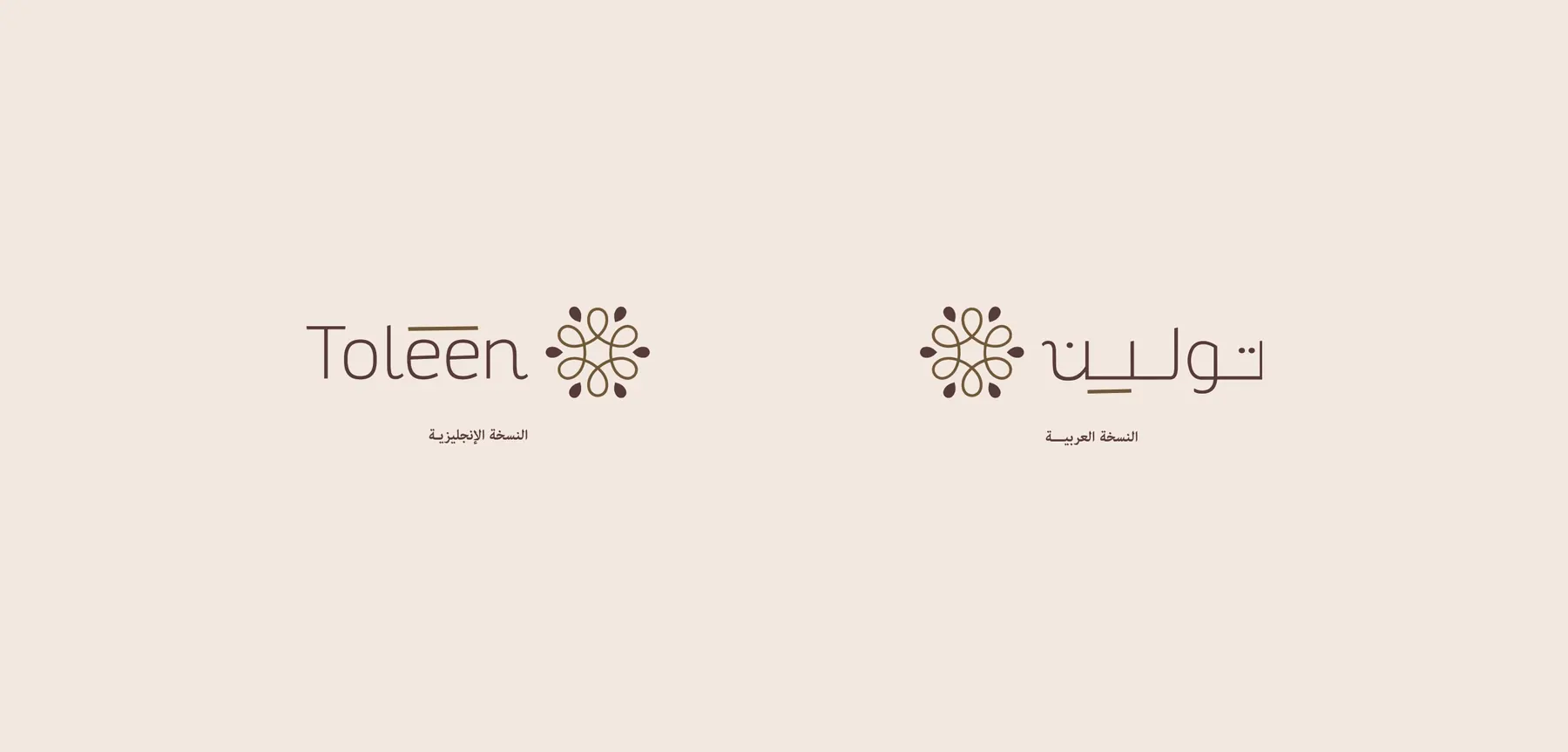
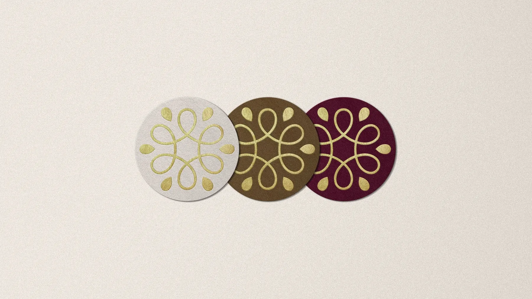
An Arabic and English name around a floral emblem, with a short version and the emblem on its own.

02
Colour
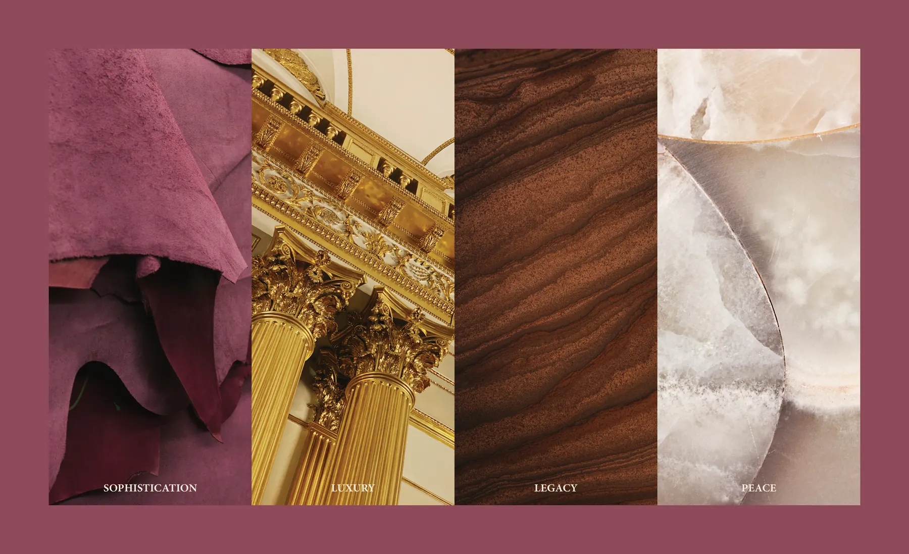
Burgundy, gold and off-white, drawn from velvet, gilded columns, dark wood and marble.
- Dark Burgundy#5B1C33
- Gold#A57D45
- Dark Gold#583B39
- Off-White#EEE7DF
- Almost Black#1B1010
03
Typography
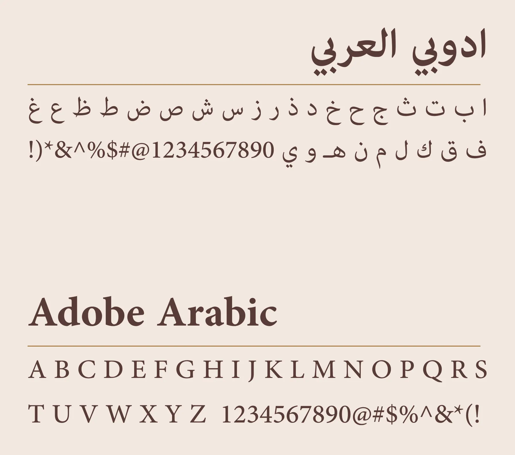
One classic family across Arabic and English, so the menu, the signs and the table cards share one voice of old-world hospitality.
- Adobe Arabic
- Arabic and English
04
Voice
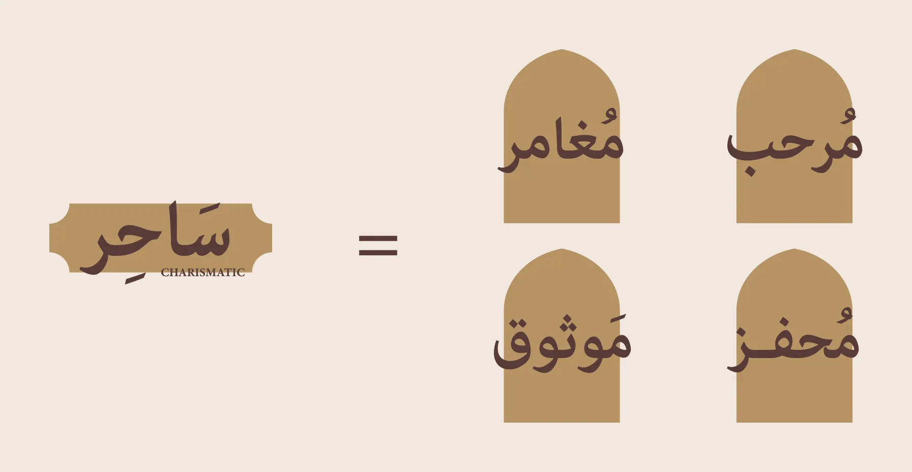
Warm and cheerful: welcoming, adventurous, trustworthy, inspiring, clear.
05
Elements
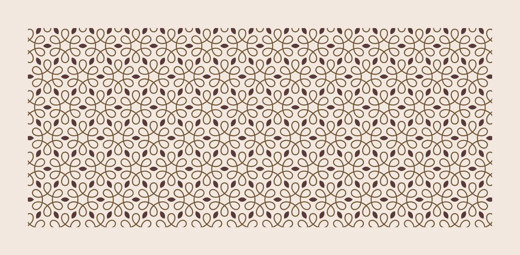
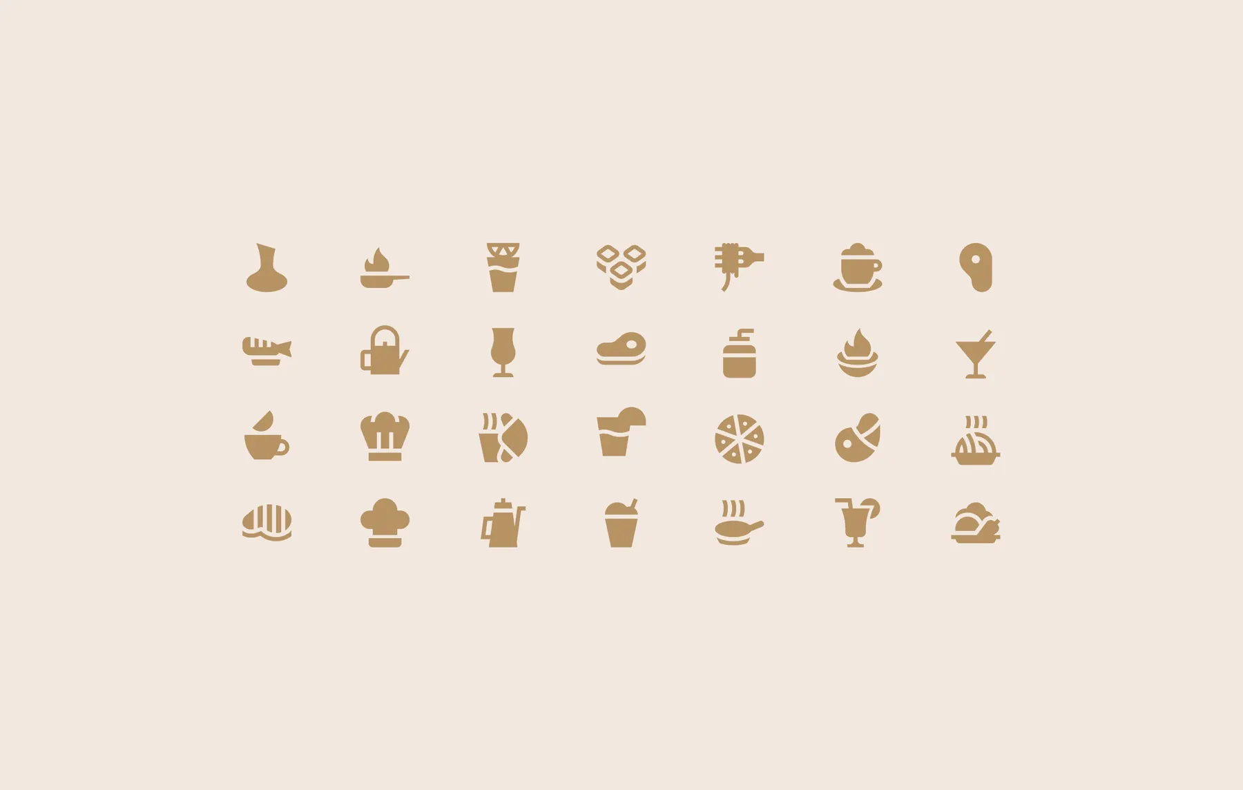
A pattern built from the emblem and a set of food and drink icons.
06
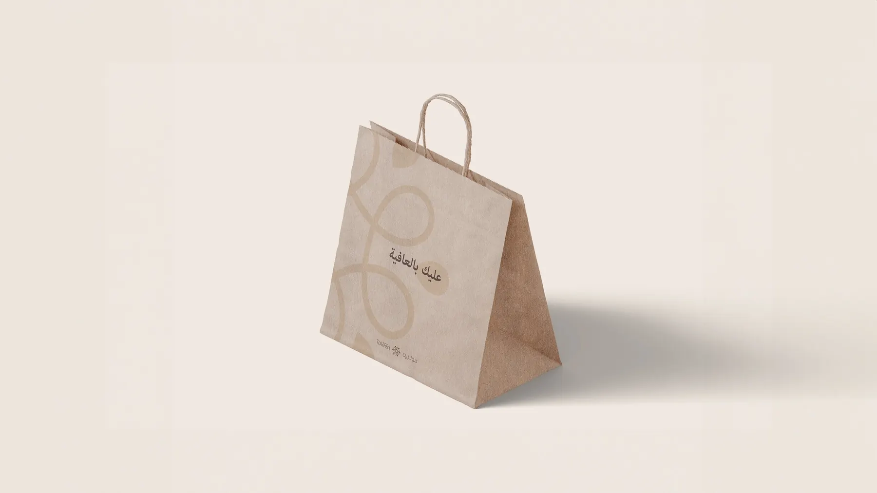
Applications

 Next projectAo Architects
More works
All case studies

Let’s create something memorable together
Get in touchhey@thatgroup.co